


A crypto chart looks intimidating the first time you open one. Filled with confusing candles of different colors, lines weaving across the price, numbers updating every second. Not only so, unlike a stock chart, a crypto chart carries a few pieces of information (funding rates, open interest, order book depth) that don't exist anywhere else in trading and that most beginner guides skip entirely.
But trust us: none of it is complicated once broken into its actual parts.
This guide covers chart reading from the ground up -- what a candlestick actually shows, how to choose a timeframe, the handful of indicators worth learning first, the patterns worth recognizing, and the crypto-specific signals that separate a novice from a professional.
What a Candlestick Actually Shows
Every candlestick on a crypto chart represents one fixed period of time (a minute, an hour, a day, whatever timeframe is selected) and encodes four numbers into a single shape:
- The open
- The high
- The low, and
- The close
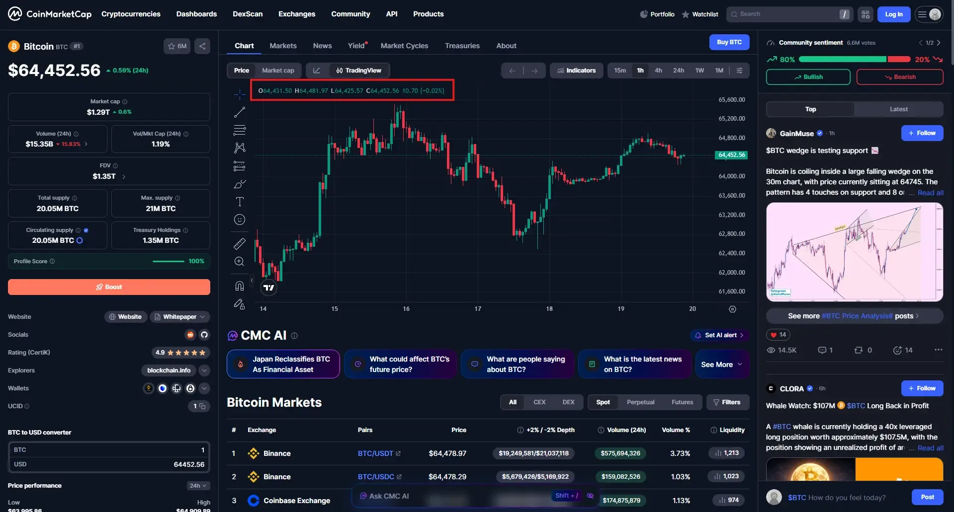
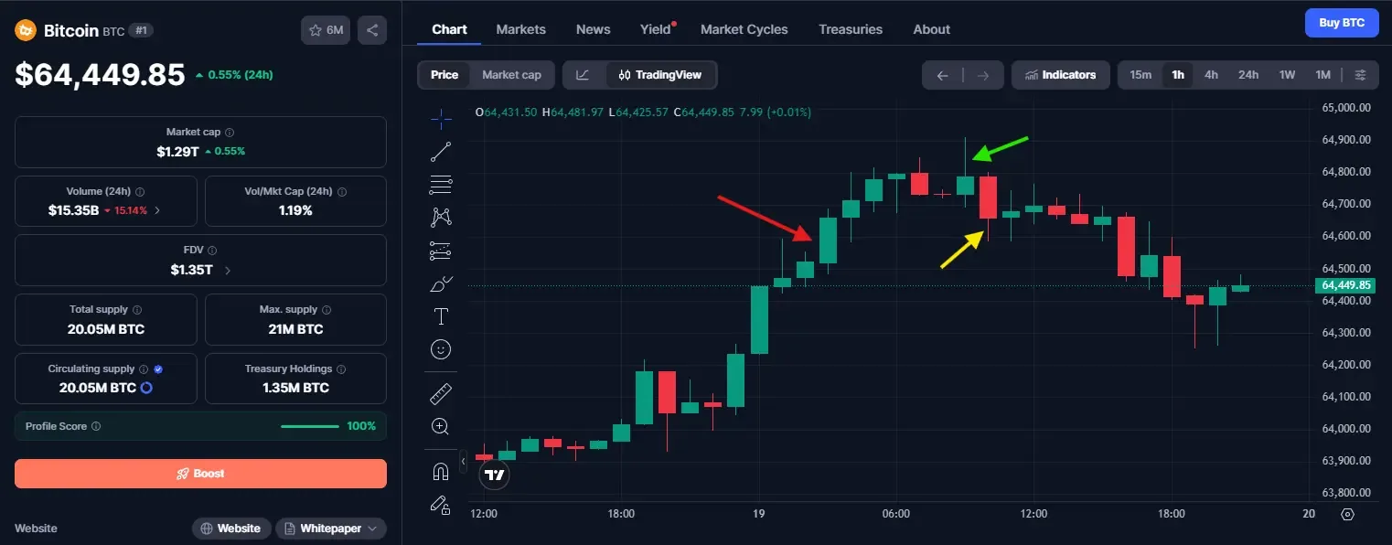
When we look at the chart, it’s filled with green and red blocks with thin lines extending above and below it.
The thick rectangular section (red arrow) is the body, which spans from the opening price to the closing price for that period.
The thin lines extending above (green arrow) and below (yellow arrow) are called wicks (sometimes called shadows). They mark the highest and lowest price reached during that period, even if the price didn’t stay there.
Color tells you which side won. A green (or sometimes white) candle closed higher than it opened, meaning buyers were in control for that period. A red (or black) candle closed lower than it opened, meaning sellers had the upper hand.
A long body signals conviction in one direction. A short body, especially one with long wicks on both ends, signals hesitation, buyers and sellers fighting to a rough draw.
Candlestick charting itself isn't new. It originated in 18th-century Japan for tracking rice prices, and it remains the standard format across crypto, stocks, and forex today because it packs more information into a single glance than a simple line connecting closing prices ever could.
Chart Types Worth Knowing
Candlesticks are the default on nearly every crypto platform, but a few alternatives show up from time to time:
| Chart Type | What It Shows | When It's Useful |
|---|---|---|
| Candlestick | Open, high, low, and close for each trading period | Default choice for most day trading because it clearly shows price action and market sentiment. |
| Line | Only the closing price, connected across periods | Quick trend overview that removes noise from intraperiod price swings and wicks. |
| Bar (OHLC) | Open, high, low, and close shown as tick marks instead of a candle body | Common on professional trading platforms; provides the same information as candlesticks in a more compact format. |
| Heikin-Ashi | A smoothed version of candlesticks that averages price data to reduce market noise | Helpful for identifying sustained trends more clearly, though it sacrifices exact price precision. |
For day trading specifically, standard candlesticks are worth mastering first. The other formats are worth knowing exist, not worth switching to before candlesticks feel intuitive.
Choosing a Timeframe
Opening a 1-minute chart on day one is a very common beginner’s mistake. Most of what shows up at that timeframe is noisy and moves fast -- you need a lot more experience before you can tackle trading at this scale.
A more workable approach starts from the top and narrows down:
- Check the daily chart first for overall trend direction. Is price broadly climbing, falling, or ranging sideways over the past several weeks?
- Move to a 4-hour chart to see how that trend has been unfolding more recently, and to spot the more significant support and resistance levels.
- Use a 15-minute or 5-minute chart for actual trade timing and entries, once the higher timeframe context is clear.
A 5-minute setup fighting the daily trend is a weaker trade than the chart alone suggests. Reading the higher timeframe first, then narrowing down for entry, keeps decisions aligned with the bigger picture instead of reacting to noise.
Trend, Support, and Resistance
Before any indicator or pattern is worth applying, it helps to identify two things on any chart: which direction the market has generally been moving, and where price has previously struggled to break through.
- Support is a price level where buying pressure has previously stepped in and stopped a decline.
- Resistance is the opposite: a level where selling pressure has previously capped a rally.
Neither is a hard, guaranteed wall. You can think of them as zones where price has reacted before, and where it's worth paying closer attention if price approaches again. That’s why, before you look at any specific trade setup, a useful habit to get into is checking whether the current price is near a known support or resistance level, or sitting in open space between them. A pattern or indicator signal that lines up with a real support or resistance level carries more weight than the same signal appearing in the middle of nowhere.
Volume: The Confirmation Layer
If price tells you what happened, then volume tells you how much conviction was behind it.
A breakout above resistance on unusually high volume suggests there’s real buying interest driving the move. The same breakout on thin volume is far more likely to fail and reverse, since it may simply reflect a lack of sellers rather than a genuine shift in demand. As a general rule, price moves are more trustworthy when volume confirms them, and more suspect when volume is flat or declining while price moves sharply.
Core Indicators Worth Learning First
It's tempting to load a chart with a dozen indicators. In practice, two or three, used consistently, tend to outperform a cluttered chart where signals contradict each other and obscure the underlying price action.
| Indicator | What It Measures | How It's Commonly Used |
|---|---|---|
| Moving Average (MA) | The average price over a set number of periods, smoothing out short-term market noise | Identifying trend direction; price above a rising MA often suggests an uptrend. |
| RSI (Relative Strength Index) | Momentum, scaled from 0 to 100, based on recent gains versus losses | Readings above 70 suggest overbought conditions, while readings below 30 suggest oversold conditions. |
| MACD (Moving Average Convergence Divergence) | The relationship between two moving averages of different lengths | Crossovers can signal shifting momentum, while divergence from price may indicate a weakening trend. |
| Bollinger Bands | A moving average with upper and lower bands based on market volatility | Price near the outer bands may indicate a stretched move, while band width reflects rising or falling volatility. |
| VWAP (Volume-Weighted Average Price) | The average trading price weighted by volume, typically reset each trading day | A common benchmark for determining whether the current price is trading above or below the day's average price. |
Think of these indicators as a summary of what's already happened condensed into something easier to scan than raw price alone. One moving average, RSI, and volume together are usually enough to build real skill before layering on anything more complex.
Candlestick Patterns Worth Recognizing
You’ll find a few candlestick patterns showing up time and time again on a chart, and it’s absolutely worth learning what they mean and are foretelling. Do note, however, that a shape by itself is just a shape. You also need to take into account the trend behind it, the volume around it, and whether it's sitting on a real support or resistance level -- all these will decide if the pattern’s worth paying attention to or not.
- Doji: The open and close are nearly identical, forming a thin cross shape. It signals hesitation, buyers and sellers reaching a rough stalemate, and can precede a reversal when it appears after a sustained move.
- A thin doji can be seen in this Bitcoin candlestick graph.
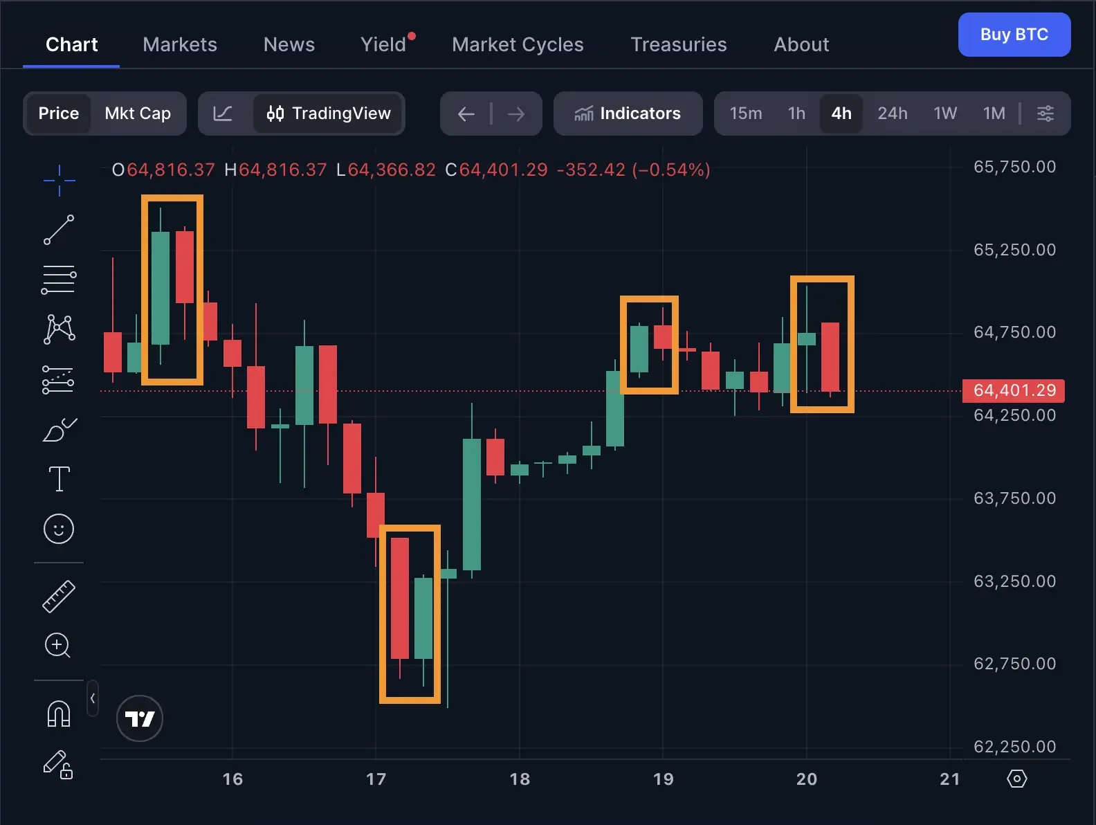
- Engulfing pattern: A candle whose body completely covers the previous candle's body, in the opposite color. A bullish engulfing candle after a decline suggests buyers have taken control, while a bearish engulfing candle after a rally suggests the reverse.
- We can see several instances of an engulfing pattern in this example.
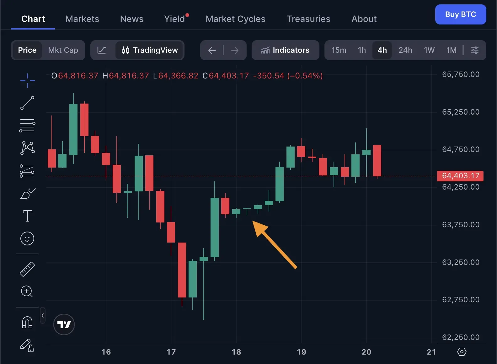
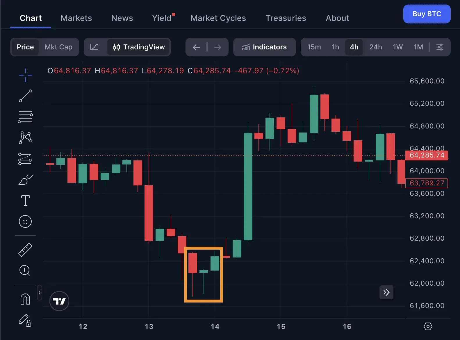
- Morning star/evening star: A three-candle sequence. The morning star starts with a bearish candle, pauses on a small-bodied or doji candle, then closes bullish on the third, suggesting sellers are losing control. The evening star is the mirror image at the top of an uptrend.
- This example is one of the more dramatic examples of a morning star pattern: in the orange highlight box, we first see a bearish candle bottoming at around $62,800, then a doji (signifying indecision) before price skyrocketed to $64,800.
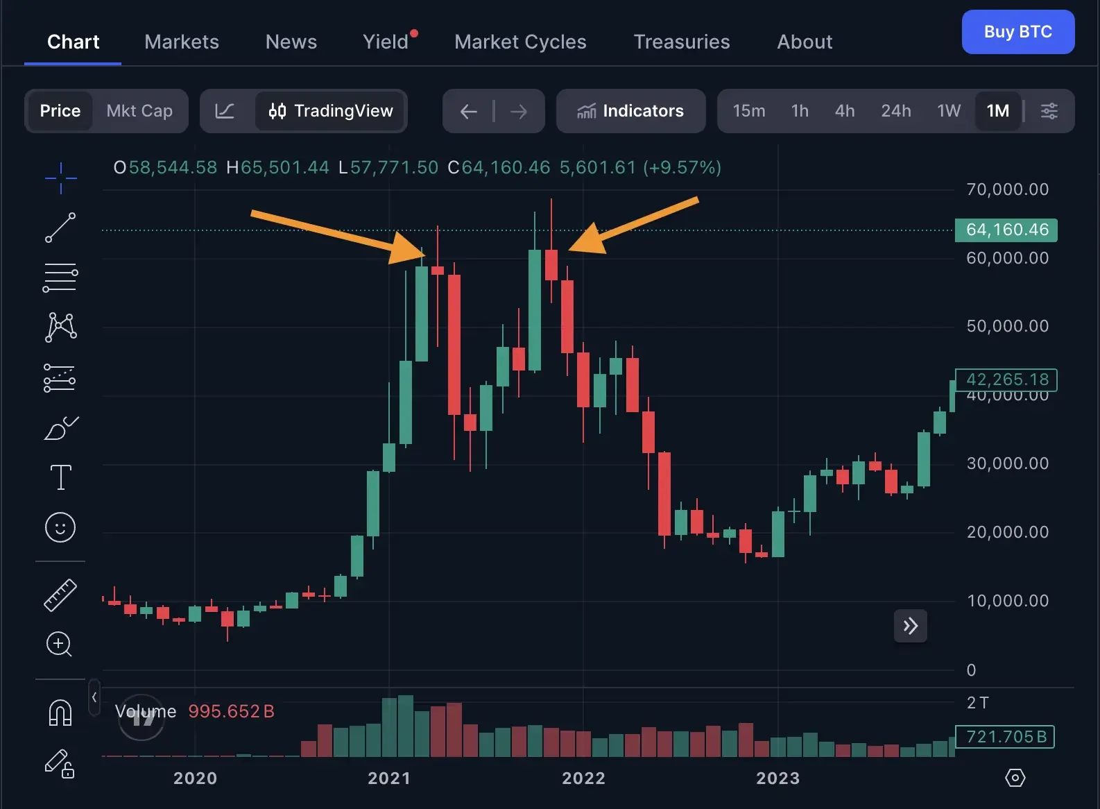
- Double top / double bottom: Price reaches a similar high (or low) twice, then reverses. The reversal isn't confirmed until price actually breaks the level between the two peaks or troughs (commonly called the neckline), ideally on rising volume.
- In this graph, we can see two prominent “tops” where the price peaked before falling, with a “neckline” between each top – this is a classic double-top pattern.
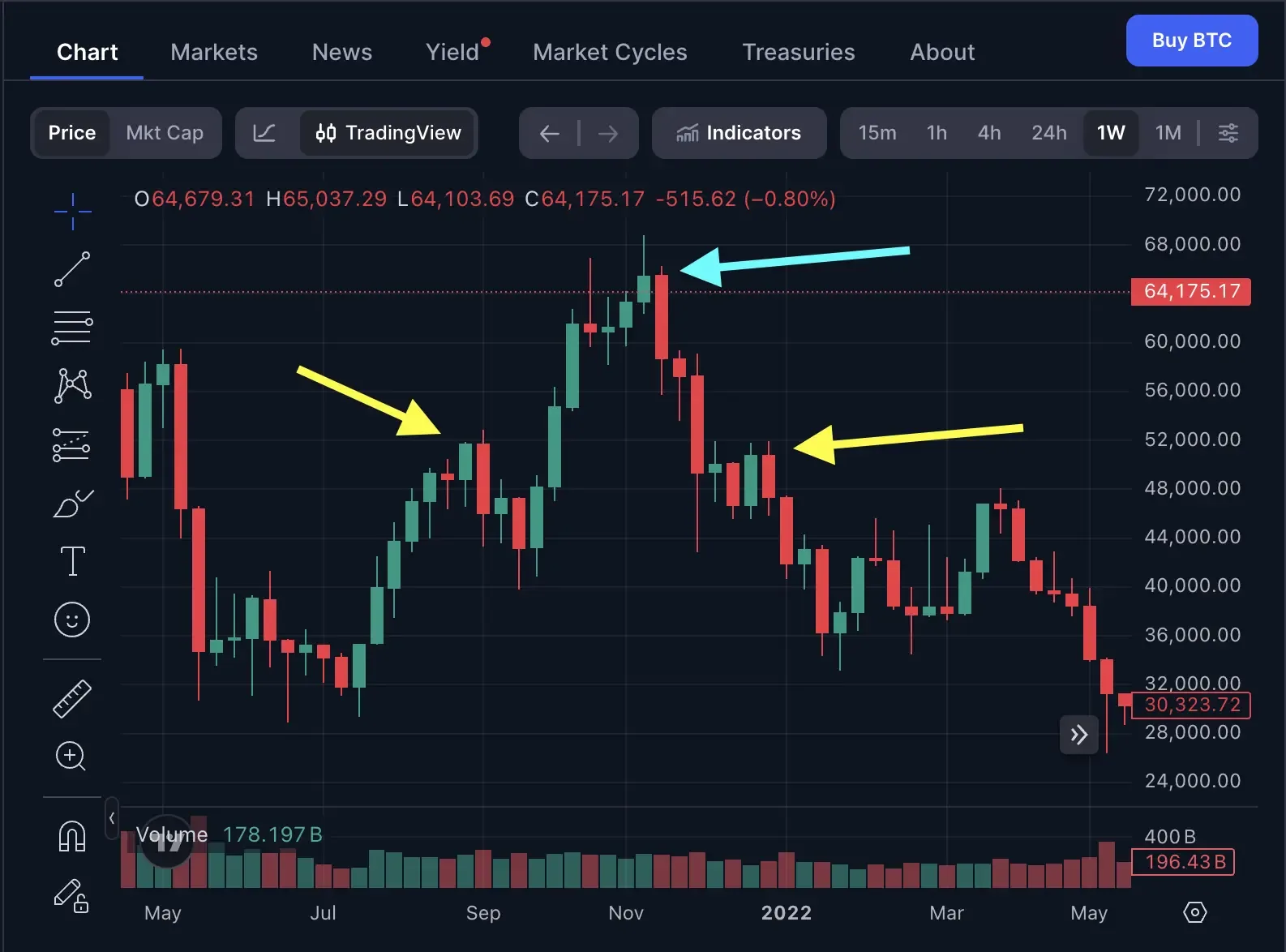
- Head and shoulders: A three-peak formation where the middle peak is higher than the two surrounding it. Like the double top, it's not considered complete until price breaks the neckline connecting the two lower points, and volume on that break matters for confirming the pattern rather than dismissing it as noise.
- In this example, the head is marked with a cyan arrow, and the shoulders are marked with yellow arrows.
The recurring caveat across all of these: a pattern without volume or a genuine structural break is a shape on a screen, not a confirmed signal. Waiting for that confirmation avoids a meaningful share of false reversals.
What Makes Crypto Charts Different From Everything Else
A trader who's only read stock or forex charts will notice several things immediately once they're pulled into crypto.
- The market never closes: There's no opening bell, no closing bell, and none of the overnight gaps equities deal with. Price action runs continuously, so important moves can happen at any hour, and a level that formed at 3 a.m. matters just as much as one that formed during a conventional trading day.
- Volatility runs higher, and corrections run deeper: Bitcoin traded near an all-time high of $126,000 in October 2025. By mid-2026, it had given back more than half of that. That's the scale of move crypto deals in regularly, and altcoins tend to swing even harder, in both directions, than Bitcoin does. Chart patterns and indicators still apply, but the swings they're measuring tend to be larger than a trader coming from equities or forex will be used to.
- Liquidity is fragmented across exchanges: Unlike a single centralized stock exchange, the same crypto asset trades simultaneously across Binance, Coinbase, Bybit, Kraken, and dozens of others, each with its own order book and, for perpetual futures specifically, sometimes its own price. Reading a chart on one exchange doesn't always tell the full story of what's happening market-wide.
Reading Perpetual Futures: Funding Rates and Open Interest
Perpetual futures ("perps") are the most heavily traded crypto derivative, and they carry a signal that doesn't exist in spot trading at all: the funding rate.
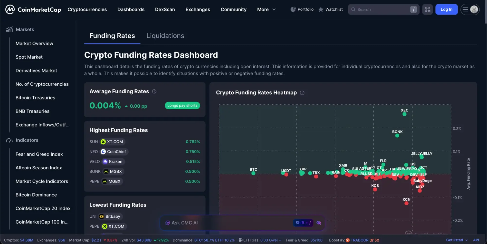
A perpetual futures contract has no expiration date, unlike a traditional futures contract. Since it never expires and settles, exchanges need a mechanism to keep its price tethered to the actual spot price of the underlying asset. That mechanism is the funding rate: a periodic payment, typically every eight hours, exchanged directly between long and short position holders. When the perpetual contract trades above spot price, funding turns positive and longs pay shorts, which creates an incentive to short and pulls the contract price back down toward spot. When the perpetual trades below spot, funding turns negative and shorts pay longs instead, pulling the price back up.
The common mistake is reading a high positive funding rate as a bullish signal. It isn't (at least not directly) -- a sustained high positive funding rate actually reflects crowding: an unusually large number of traders are paying a premium to stay long, which increases the cost of holding that position over time and can precede a deleveraging event (a wave of long liquidations) rather than signal further upside. The funding rate exists to close the gap between spot and perpetual prices, not to forecast direction.
Open interest (the total number of outstanding derivative contracts that haven't been closed) is another variable tracking alongside funding. Rising open interest combined with rising funding often signals a buildup of directional positioning, a market getting more crowded in one direction, which can set up sharper reversals once that positioning starts to unwind. Open interest has no equivalent in spot markets, since it's specific to how many open derivative positions currently exist.
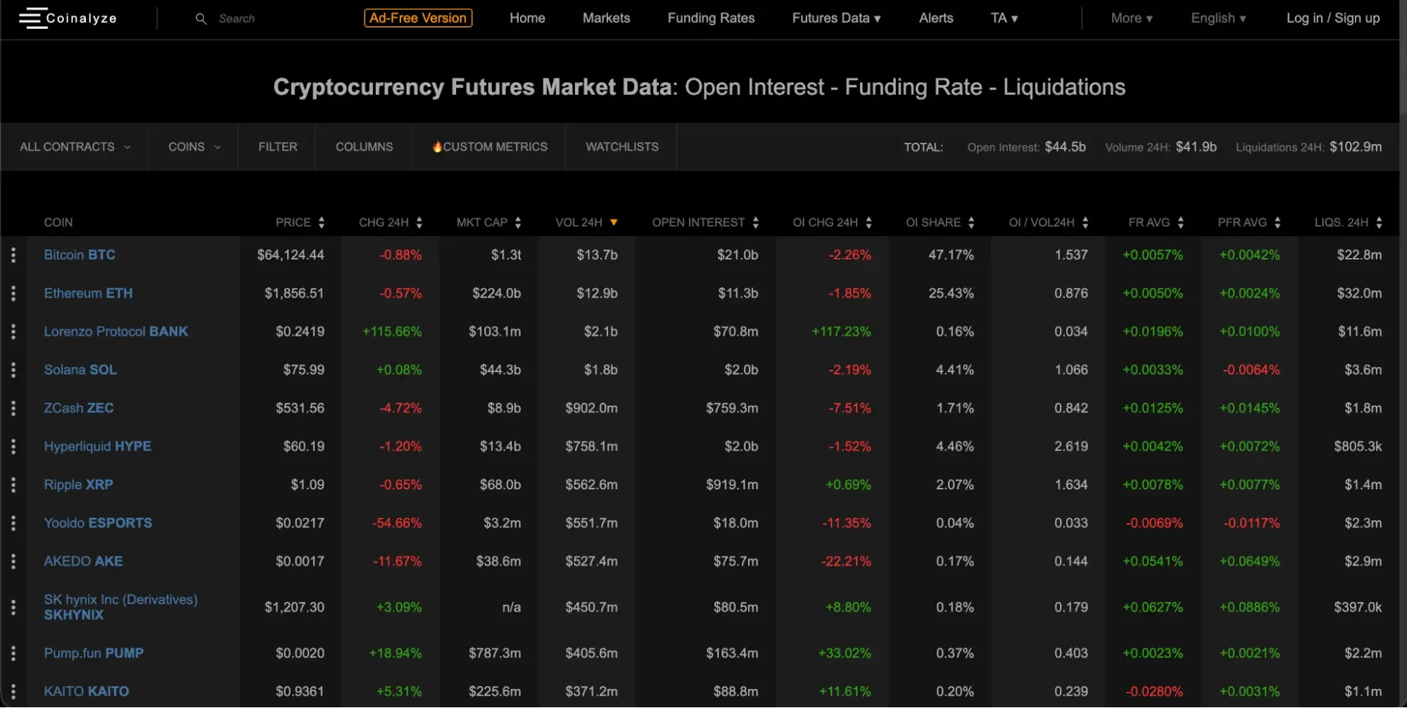
Free dashboards such as Coinalyze exist specifically for tracking these figures across exchanges in one place, which is worth using rather than trying to check funding rates exchange by exchange manually.
Reading the Order Book and Depth Chart
Beneath every price chart sits an order book: the real-time, continuously updating list of every open buy order (bids) and sell order (asks) for a given asset, ranked by price.
A depth chart visualizes that order book, typically as two shaded areas extending from the current price, one showing cumulative buy orders below price and one showing cumulative sell orders above it. A thicker, deeper book on either side means more orders would need to be absorbed to move price meaningfully through that zone. A thin book means the opposite: even a moderately sized order can push price through a level quickly, since there isn't enough resting liquidity to absorb it.
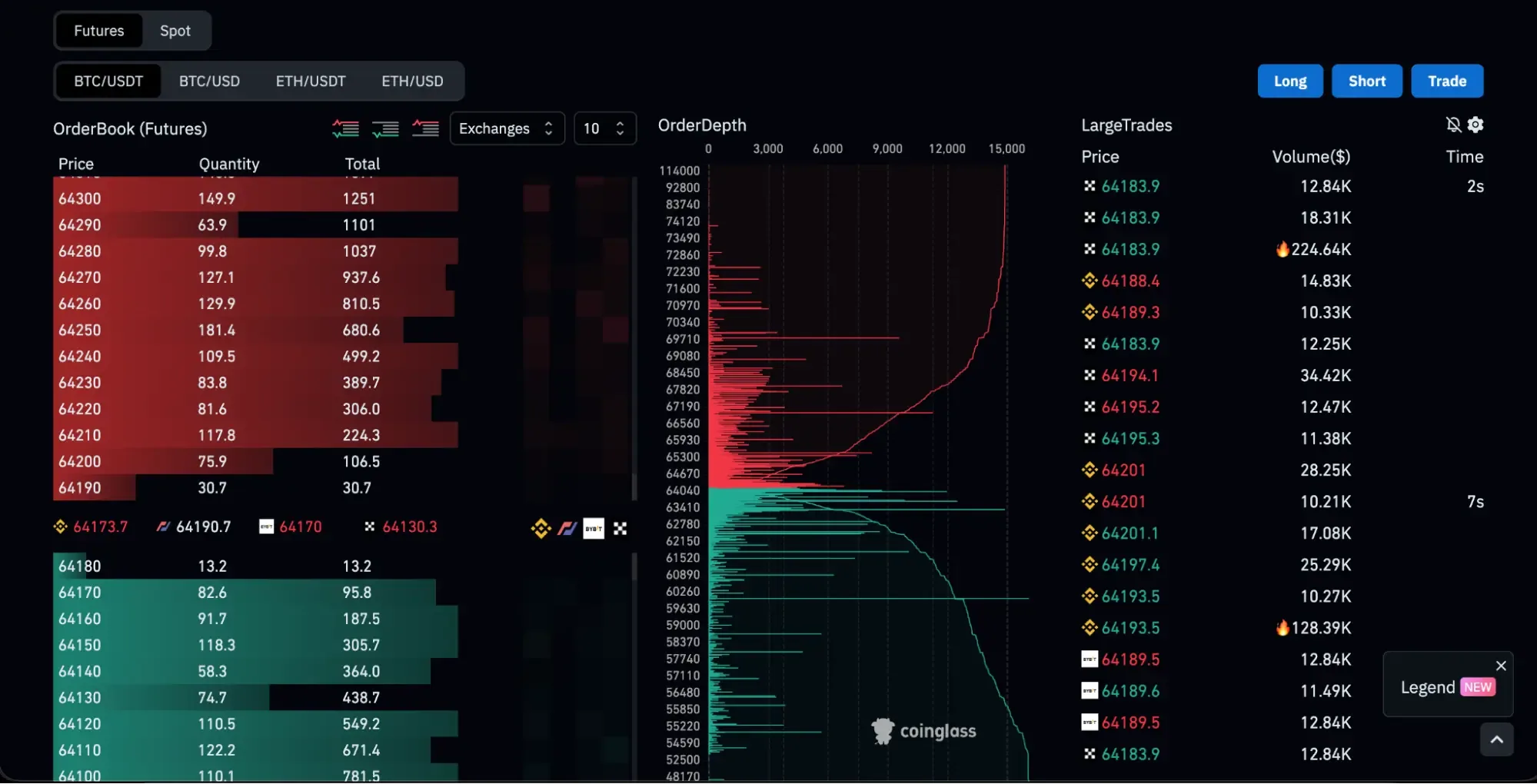
For these two things, here’s a couple of things to keep in mind:
- A large resting order (sometimes called a wall) isn't a guarantee: It can be pulled or canceled the moment price approaches it, which is a common tactic to create a false impression of support or resistance.
- Imbalance matters more than any single order: Comparing cumulative buy volume against cumulative sell volume across a fixed price range gives a better read on near-term pressure than fixating on one large order.
- Thin books amplify price impact, which is particularly relevant for lower-liquidity altcoins where a single sizable market order can move price several percent in seconds.
No single one of these signals (funding rate, open interest, order book depth) should be read in isolation. Combined with price action, volume, and trend, they add real context that a price chart alone doesn't provide. Used alone, any one of them can mislead just as easily as it can inform.
Putting It All Together: A Practical Workflow
Now that you’ve learned the basics, it’s time to condense everything into a repeatable workflow that ties everything together. Each trader has their own way of doing things, but for beginners, a serviceable workflow should look something like this:
- Check the daily chart for the broader trend.
- Identify the nearest meaningful support and resistance levels.
- Narrow to a 15-minute or 5-minute chart for timing.
- Look for a recognizable candlestick pattern or setup forming near one of those levels.
- Confirm with volume. Is participation backing the move, or is it thin?
- For perpetual futures specifically, check funding rate and open interest for signs of crowding in either direction.
- Define the stop-loss level before entering, not after.
- Calculate the reward-to-risk ratio. A setup offering less than roughly 2:1 is generally not worth taking regardless of how convincing the chart looks.
- Size the position so that hitting the stop costs no more than 1% to 2% of total account equity.
- Need more equity and leverage? Consider signing up for prop firms for cryptos such as Atlas Funded with multiple funding models to help you scale up your trades.
Common Mistakes When Reading Crypto Charts
Before you go, internalize these common mistakes first:
- Overloading the chart with indicators: Ten overlapping tools tend to contradict each other and obscure the price action they're meant to clarify. Two or three, understood well, outperform a cluttered screen.
- Trading against a confirmed trend: A bullish-looking candlestick pattern in the middle of a strong downtrend is a weaker signal than the same pattern appearing during a broader uptrend. Reversals need to be confirmed on a higher timeframe before being acted on.
- Reading funding rate as a directional signal: A high positive funding rate signals crowding, not confirmation that price will keep climbing. Treating it as a buy signal has caught out a meaningful number of traders during exactly the setups that later unwound sharply.
- Trusting a single order book wall: Large resting orders can be canceled the instant price nears them. Reading order flow through imbalance and volume, rather than fixating on one order, holds up better.
- Ignoring liquidity fragmentation: A chart on one exchange doesn't necessarily reflect the full market, particularly for lower-volume altcoins traded across many venues simultaneously.
- Trying to catch a falling price with no confirmation: Assuming a sharp decline has to reverse simply because it's fallen a long way is one of the more expensive assumptions in crypto specifically, where declines can continue much further than they would in more liquid, regulated equity markets.
Final Verdict: Chart Reading Is Totally Learnable Skill
Charts can be extremely intimidating the first time you look at them, but once you’ve understood the basic elements (candlesticks, timeframes, trend, volume, indicators, funding rates, etc.) -- with a bit of practice, the patterns will be clear and these charts will become one of your most valuable tools for navigating the market.
For traders who've built this skill on a demo account and are ready to apply it with real size, Atlas Funded offers paths to trading up to $200,000 at a profit split of 80% to 100% without the years of savings a personal account would otherwise require. Get funded and start trading real size today.
Ready to take the next step? Explore AtlasFunded's prop trading programs today and put your trading skills to work with the capital to match.
Explore funding programs
 Senior Writer at Atlas Funded


 Your move
 Only pay the full fee after you pass
 UK
UK ES
ES DE
DE FR
FR IN
IN IT
IT